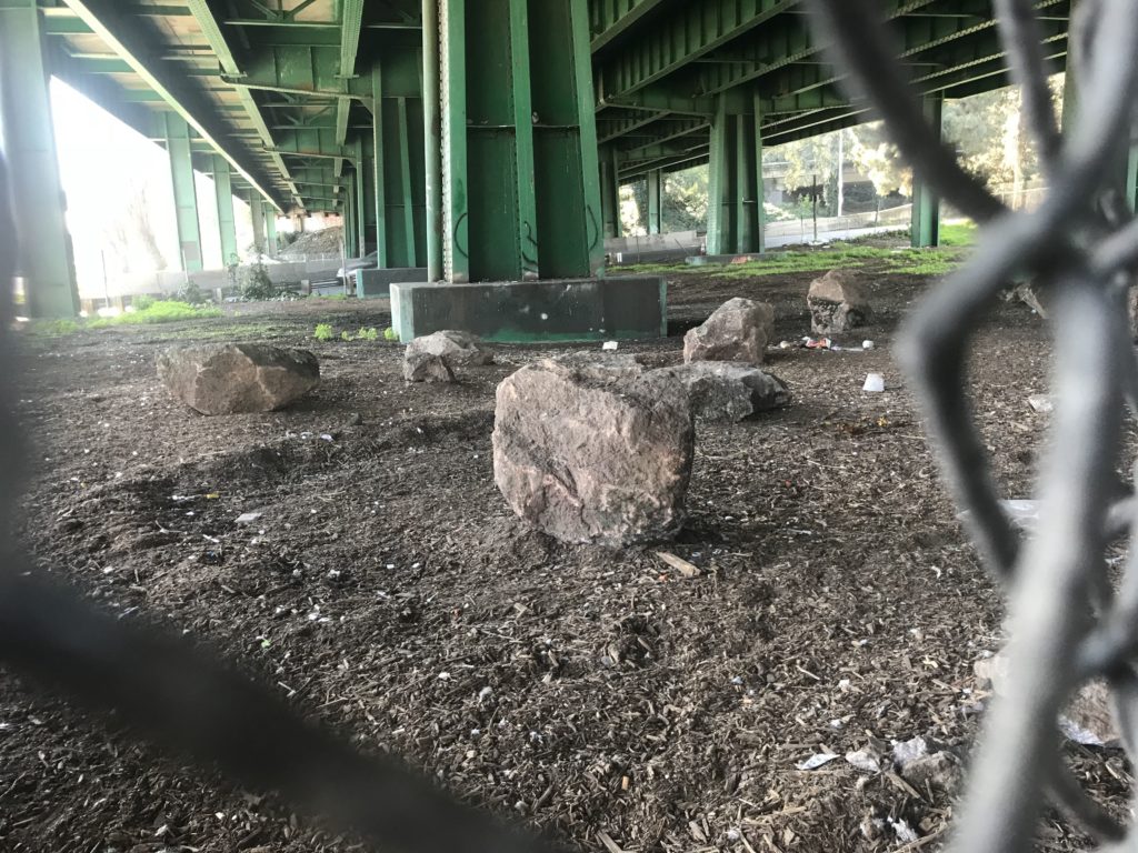
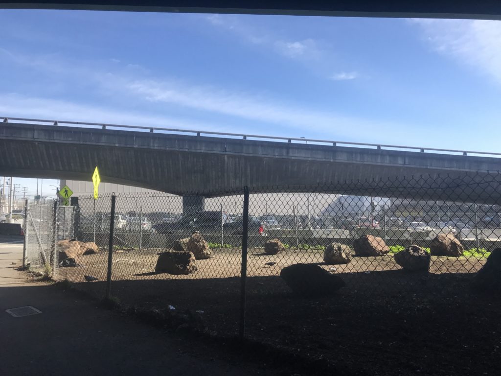
Last December, the San Francisco Department of Public Works placed boulders at the site of a tent settlement near Cesar Chavez Street and Potrero Avenue to prevent homeless people from putting up tents.
This latest development in the City’s attempts of removing encampments drew media attention and criticism from homeless advocates, including comparison to a London apartment building with 17-inch long spikes embedded in the pavement by the building’s alcove.
In 2016, an area beneath a San Diego highway overpass was strewn with jagged rocks creating enough of an obstacle for people trying to lie down, but apparently still passable for baseball fans to go to nearby Petco Field for the MLB All-Star Game.
While such tactics of erecting structural outdoor barriers drew worldwide attention, other implementations of “hostile architecture” or “anti-homeless design” have long been in place, many of which are hidden in plain sight and likely to be in your neighborhood.
No matter how subtle, such design still serves as an impediment to homeless people unable to sit or lie down anywhere else.
As San Francisco Chronicle columnist Caille Millner noted in 2015, “Once you start seeing anti-homeless design, you can’t stop seeing it.” Judging by the photos of hostile architecture that Street Sheet readers shared after the Coalition on Homelessness-published paper put out a call for photos of hostile architecture, these examples appear to be widespread and persistently visible.
Last year, City employees erected barricades around the Eureka Valley library branch during its outdoor redesign to prevent encampments. Later, they were removed because it violated the federal Americans with Disabilities Act. However, that didn’t stop the City from landscaping the area near the entrance of the Castro District-serving branch with sloping, rock-studded hillocks and sharp-edged stumps jutting from the surface.
Some benches around San Francisco are equipped with built-in obstructions; outside the former Rincon Center post office are benches that are are folded up and locked at the end of the day, thwarting any after-hours reclining, and the ones at Union Square have armrests in the middle, achieving the same effect.
Spikes adorn the planter boxes outside the Upper Market Safeway store. Last month, the Department of Public Works also erected barricades around the store’s perimeter.
Anti-homeless design isn’t just limited to visual deterrents; sound has also been used as a “keep out” tactic. In 2012, the Bill Graham Civic Auditorium resorted to blaring the sounds of jackhammers, motorcycles and other industrial noise through its PA system to keep unhoused people from sheltering themselves beneath the alcove of its entrance.
Less effective was the Burger King near Grove and Market streets. The classical music used to ward off homeless people failed; more complaints about the amplified music came from housed residents living about the fast-food outlet.
When examined long enough, hostile architecture appears to pick up where increased policing and “move along” orders leave off, making outdoor spaces less inviting to those who live or spend most of their days outdoors.
That appears to be the direction that U.S. cities are taking, Allison Arieff wrote in a New York Times op-ed last October. The editorial director of the SPUR urban planning organization cited the removal of park benches from plazas in the Mid-Market neighborhood as an example. Such tactics to inconvenience street people put growing disparities on display, she said.
“Inequality is escalating,” Arieff wrote, “and these spaces make that reality visible.”


